Logo redesigns that worked and those that really didn't
Amazon's quickfire logo changes
Amazon has quietly changed one of its most famous logos again, having only redesigned it in January, after people started likening it to an infamous figure from history. Click or scroll on to find out more.
Hitler comparison
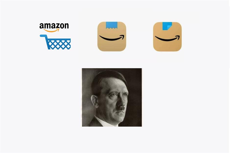
Amazon's shopping app logo on phones changed from the basket (pictured left) to a parcel with the famous smile logo and a strip of blue packaging tape at the top (pictured centre). Unfortunately, people took to social media and compared the jagged tape to a toothbrush-style moustache, most infamously sported by Nazi dictator Adolf Hitler. Amazon has now changed the logo again so the blue tape is straight and folded over at the corner (pictured right), presumably to avoid any further associations with one of history's most reviled figures.
But Amazon isn't the only company to face challenges over its logos. Altering a much-loved and instantly-recognisable company emblem is a risky business that can end in epic success or massive failure. Click or scroll through some of the best, and worst, logo redesigns of recent times.
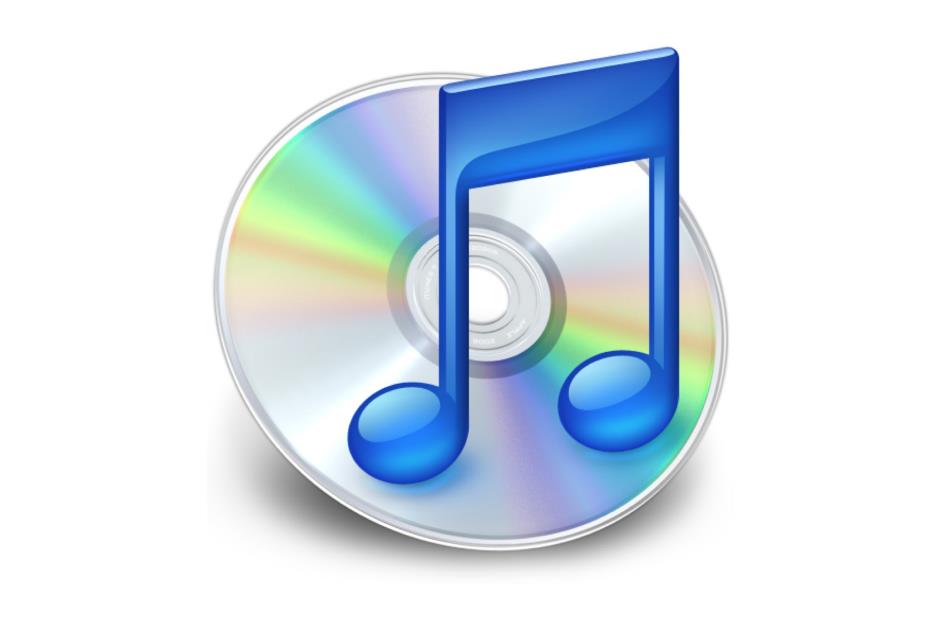
Best: iTunes – before
Sponsored Content
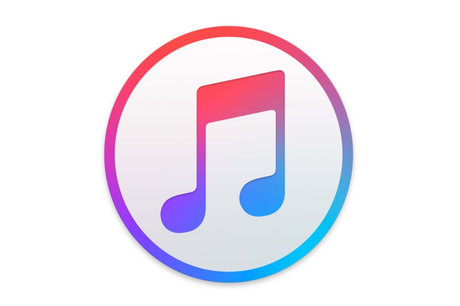
Best: iTunes – after
Best: Marriott – before
Best: Marriott – after
Sponsored Content
Best: San Diego Zoo – before
Best: San Diego Zoo – after
Best: WGN America – before
Sponsored Content
Best: WGN America – after
Best: British National Space Centre – before
Best: UK Space Agency – after
Sponsored Content
Best: CNN en Español – before
Best: CNN en Español – after
Best: FedEx – before
Sponsored Content
Best: FedEx – after
Best: US Peace Corps – before
Best: US Peace Corps – after
Sponsored Content
Best: Burger King – before
Best: Burger King – after
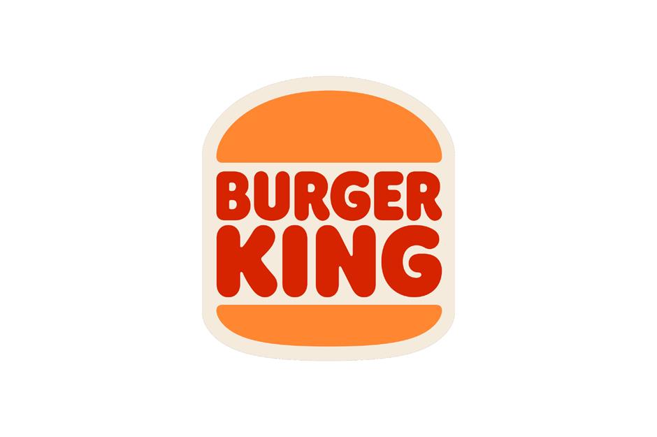
And so Burger King revealed a new stripped-back logo. The simpler approach is part of the brand's journey to move from being a meat-focused fast food chain to a company moving towards healthier ingredients. Unsurprisingly the retro design has seen many compare it to Burger King's older logo from the 90s, and its designer Jones Knowles Ritchie says that was done on purpose as Burger King wants to play on a feeling of nostalgia for the brand. And it's working, as many customers have praised the burger chain's new but familiar look.
Best: KIA – before
Sponsored Content
Best: KIA – after
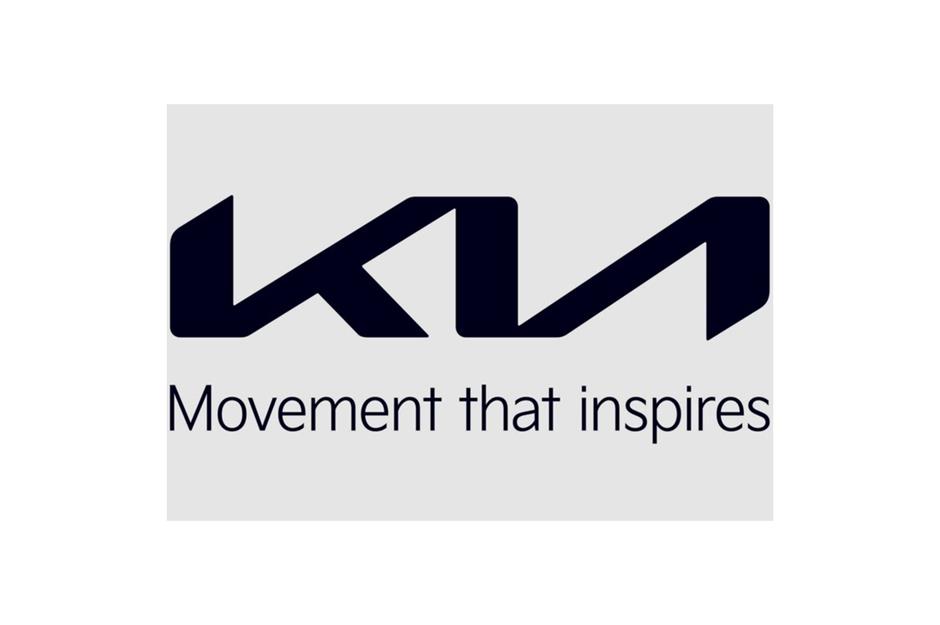
KIA's new logo features joined-up letters intended to reflect handwriting, and a slogan of "Movement that inspires" replacing its former "Power to surprise" message. The new lettering still misses the bar on the "A", but has a more italic appearance to create a sense of movement that reflects its new motto. The rebrand is part of KIA's business strategy to become a leader in the global market by focusing on electric cars and other non-traditional vehicles. Many have praised the redesign as a marked improvement on the car-maker's previously dated-looking badge.
Best: General Motors – before
Best: General Motors – after
Sponsored Content
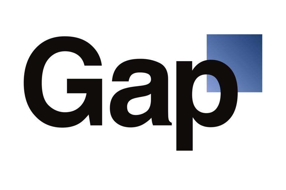
Worst: Gap – before
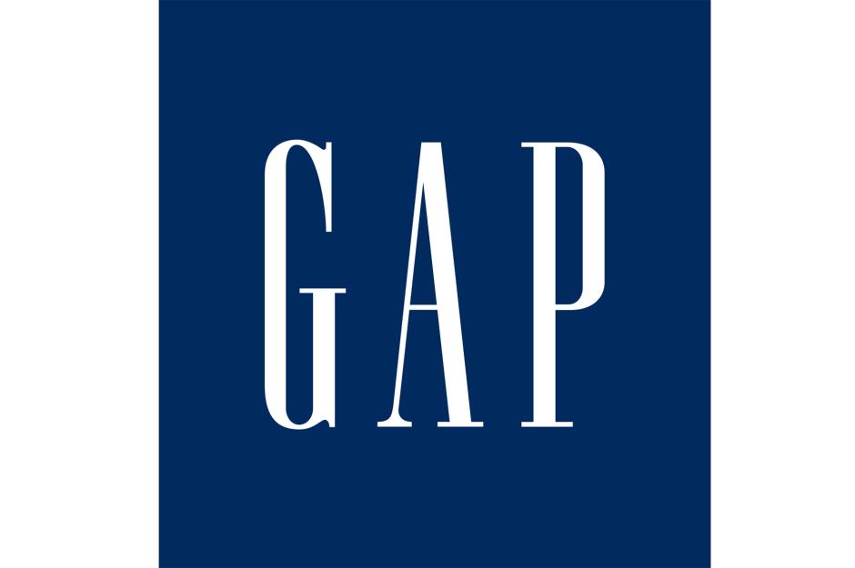
The clothing retailer was hit with a barrage of protests via Twitter and Facebook when it attempted to change its famous serif, skinny-lettered upper case logo, pictured here, in 2010.
Read about the $340k glasses and other record-breaking sales
Worst: Gap – after
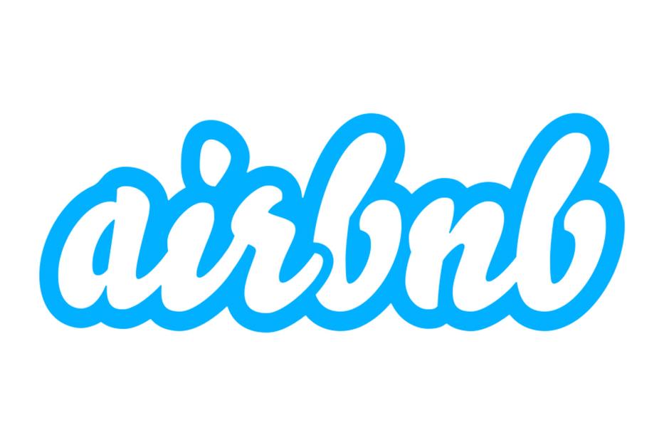
Worst: Airbnb – before
Sponsored Content
Worst: Airbnb – after
Worst: Black & Decker – before
Worst: Black + Decker – after
Sponsored Content
Worst: CareerBuilder – before
Worst: CareerBuilder – after
Worst: Netflix – before
Sponsored Content
Worst: Netflix – after
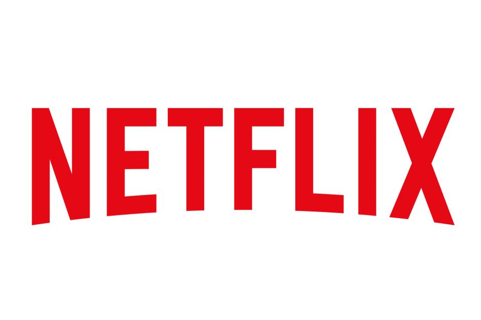
The new logo, which launched in 2014, is a mere skeleton of the former design. Many people feel it no longer triggers the strong association with Hollywood and the movies.
Discover the 50 companies that rule the world
Worst: Merck – before
Worst: Merck – after
Sponsored Content
Worst: Sci-Fi Channel – before
Worst: Syfy – after
Worst: Syfy – after
Sponsored Content
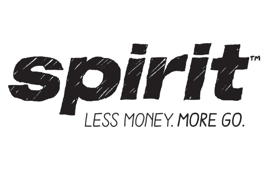
Worst: Spirit Airlines – before
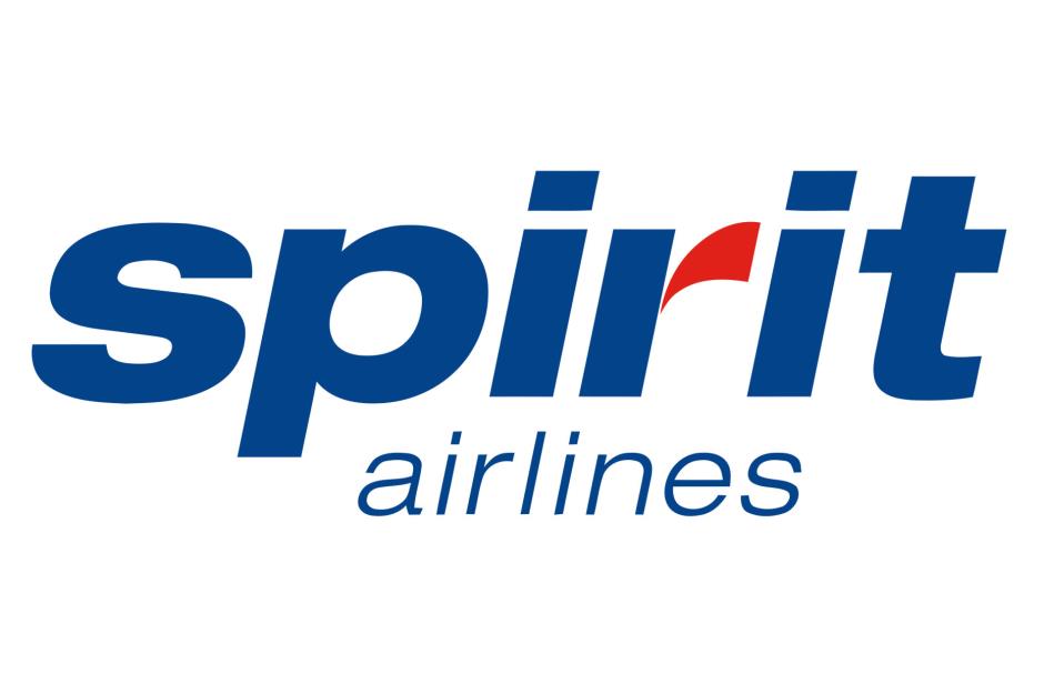
Worst: Spirit Airlines – after
Worst: Spirit Airlines – after
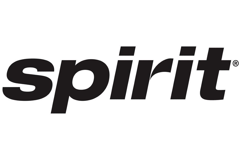
Following the criticism Spirit Airlines rebranded again, although this time the company just coloured in the parts of the wording that were missing in the sketched version. While the new logo is a lot cleaner, it does make you wonder why the airline didn't just go with this simpler version in the first place.
Sponsored Content
Worst: CIA – before
Worst: CIA – after
Worst: CIA – after
The second logo is also monochrome with sans-serif lettering, but features fractal lines in the background. The traditional eagle has been removed. But people have criticised this new logo for looking too abstract and more like a music event poster than a government agency logo. The controversy doesn't end there, as there is confusion about who actually designed the new logos. Artist Ryder Ripps, who has worked with Kanye West, Grimes, Marc Jacobs and others, took credit for the first design (at least) on Instagram but the CIA has denied Ripps was involved. However, it's still unclear if it will replace the agency's main branding beyond its website.
Now discover some everyday words that are actually brand names
Sponsored Content
Comments
Be the first to comment
Do you want to comment on this article? You need to be signed in for this feature