7 gorgeous gallery wall layouts that work every time
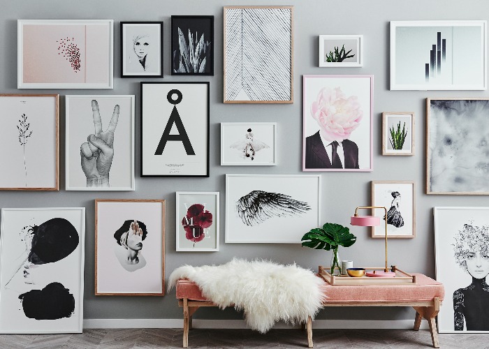
Longing for a gallery wall but don’t know where to start? Getting lots of pictures in a straight line can be tricky, so we’ve found 7 simple layouts to guarantee picture-perfect results
There are so many ways to decorate your home, but nothing adds personality quite like a gallery wall. From family photographs to original artwork, a collection of pictures that you love is proven to make you happier every time you see it.
If you’ve got a blank space, a carefully curated display gives your room a striking focal point and one that is likely to stand the test of time.
Your gallery wall can be a work in progress – one that you add to over time – but it’s a good idea to have a plan before hammering in that first nail.
They can be hard to pull off and getting from a plain wall to a beautiful, full gallery is never going to be easy. Before you begin, lay out your posters and prints on the floor to try out different combinations until you find a formation that you’re happy with.
Frame each picture first and measure the width of the wall to work out how to best arrange them to fill the blank space. Consider the empty space too: a uniform gap between frames will look smart and neat; different widths, frames and colors will look more Bohemian.
1. Find a chic corner solution
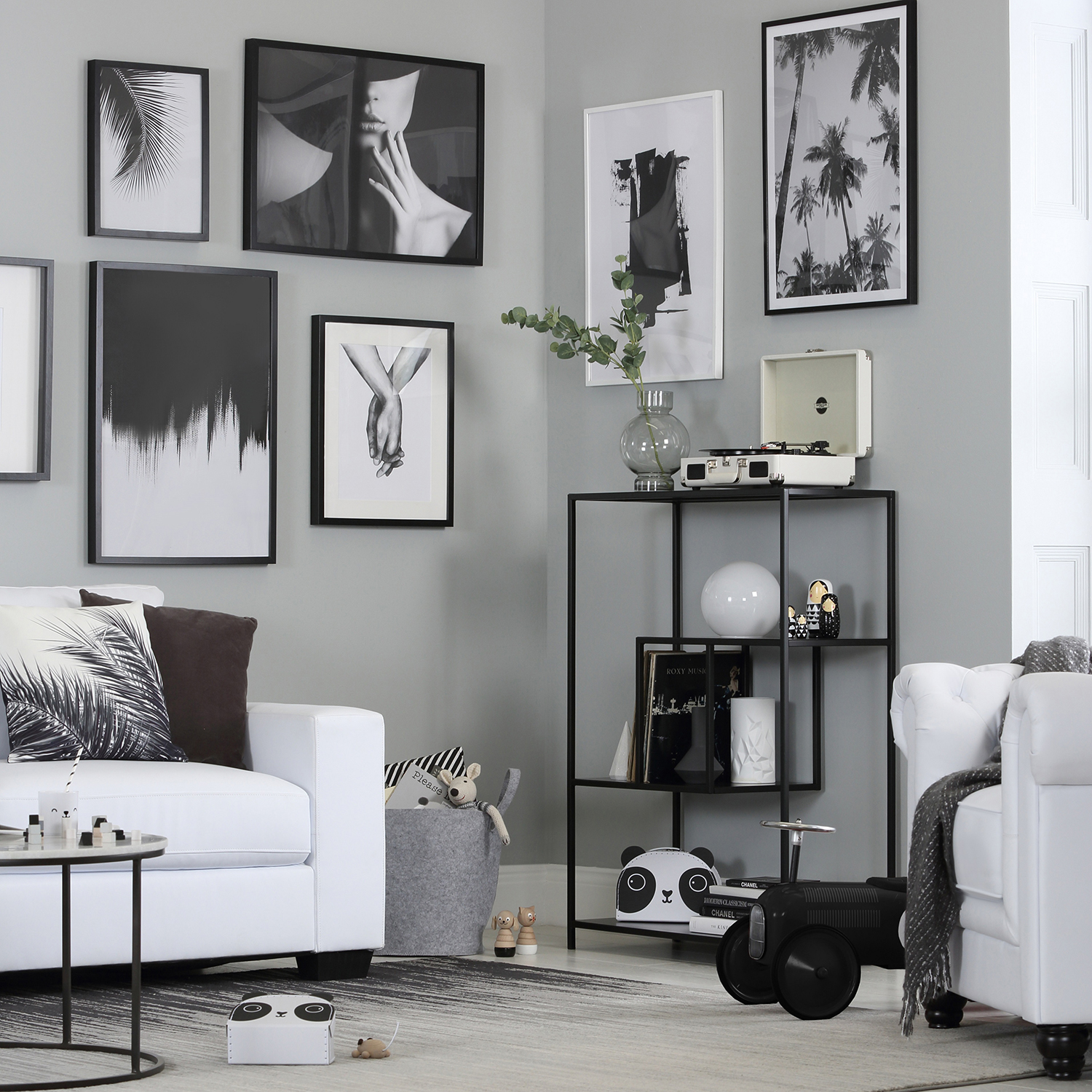
If you have a sad, empty corner in your house that looks like it could do with some love, a few pictures at right angles on each side is an easy way to breathe some life into it.
An awkward corner will turn out to be no bother when you line it with some tasteful monochrome photography. It's also a super-easy way to add dimension to a tight area that’s difficult to decorate.
Play on the contrast by using both black and white frames and hang the pictures at various heights with a difference of around six to 10 inches – anything less than three inches looks awkward.
This tasteful tableau uses abstract art, grayscale portraits and photography to create a truly modern mix that will work every time.
2. The lean
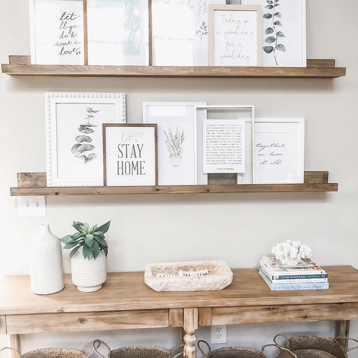
A gallery wall doesn’t always involve banging nails into a wall. Use a long, narrow picture shelf as a more casual way to show off your framed art or photographs.
Choose works in a variety of sizes and orientations for a more layered look mixing textures and materials within your chosen color scheme. In this cute country-style collection, botanical watercolors and homely messages in different typefaces work effortlessly together.
3. The picture rail
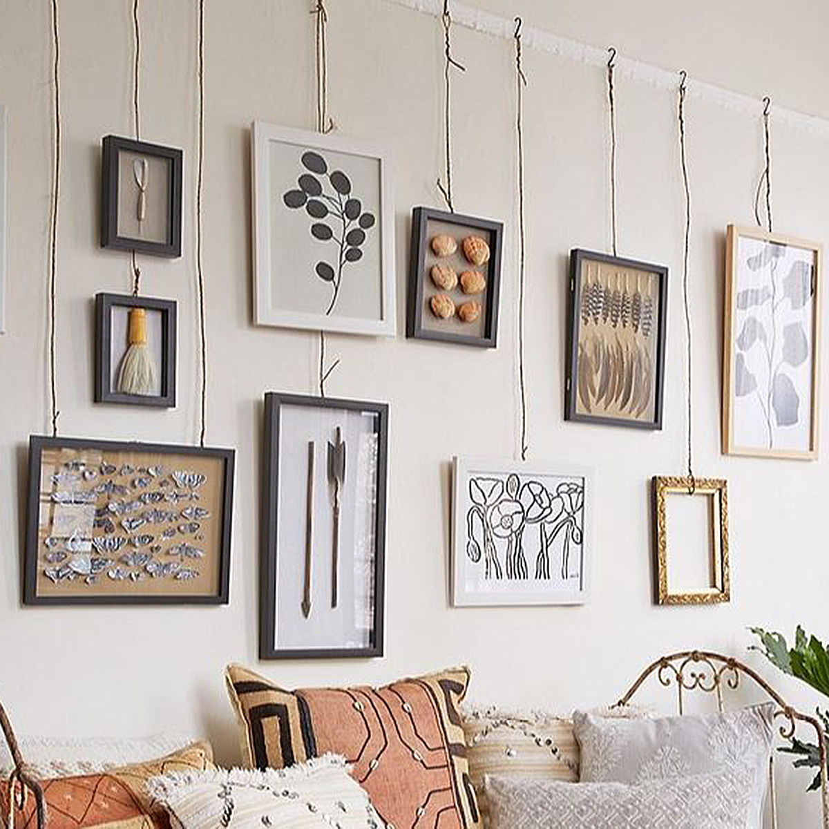
If you are lucky enough to have an original picture rail, you can give it an innovative makeover with rustic wire and string. You’ll need some S-hooks, sturdy craft wire and pliers to create this look, which celebrates the rough edges and creates a handmade feel.
This neutral collection uses feathers, shells, butterflies and ‘Objet d’art’ to create an exhibition-style display that could be straight out of a museum. Let the images lie at different heights to finish off the look.
4. The grid
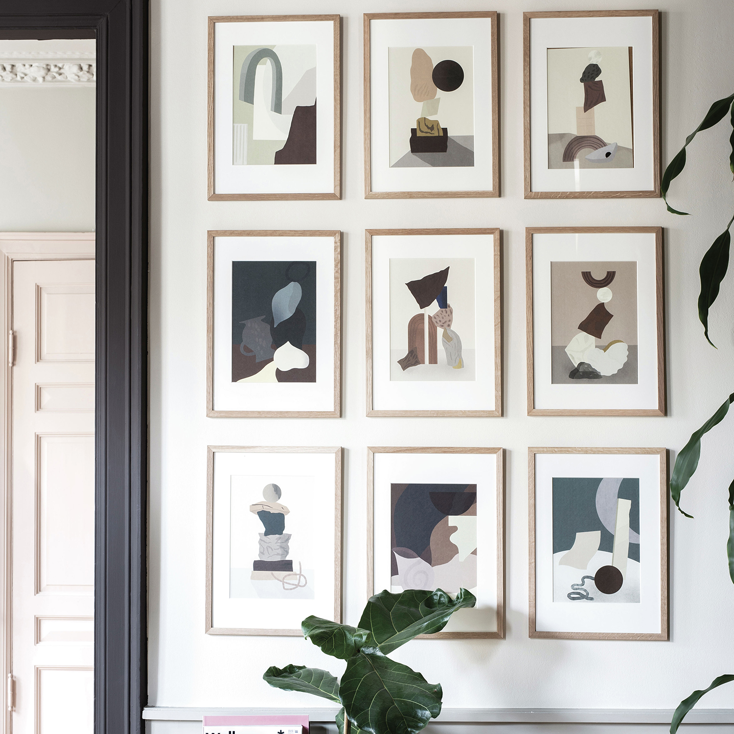
If you prefer things to be in order, a grid design might be the right layout for you.
This symmetrical look tends to fit in well with a classically styled room. Use works by a single artist and opt for matching frames for a complete, consistent look.
Hanging a grid can be a little tricky as the measurements have to be on point for exact symmetry, so use a spirit level, a tape measure and a pencil to mark up the spaces evenly.
5. The stairway
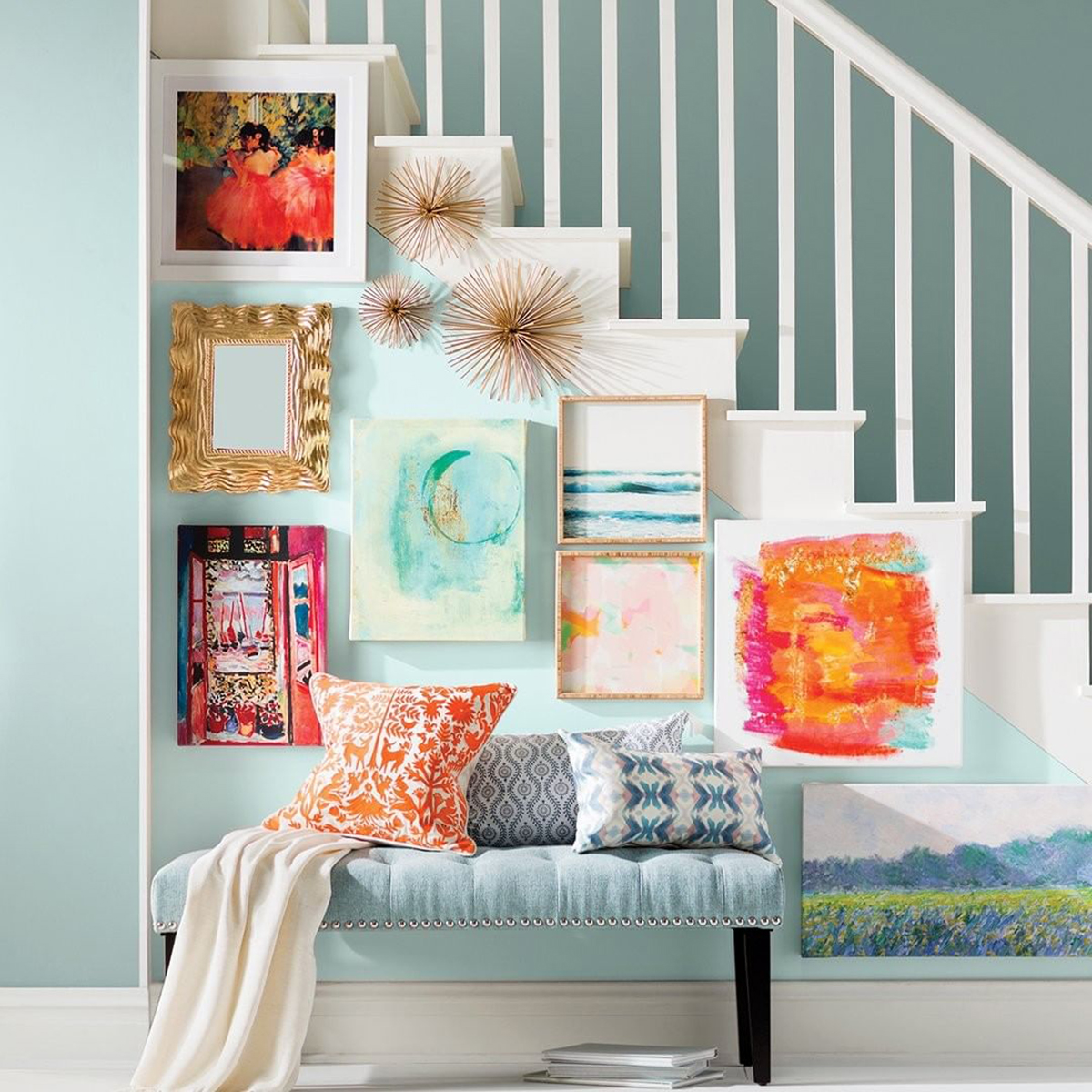
Make a statement in your hallway by decorating the dead space underneath the bannister instead of the high traffic wall above them.
Mix together some bright and bold artwork in different styles for an eclectic look, using a range of canvas shapes and frames. Fill in any awkward gaps with textural accessories, a useful mirror and add bench seating to finish off the look.
6. Mix and match
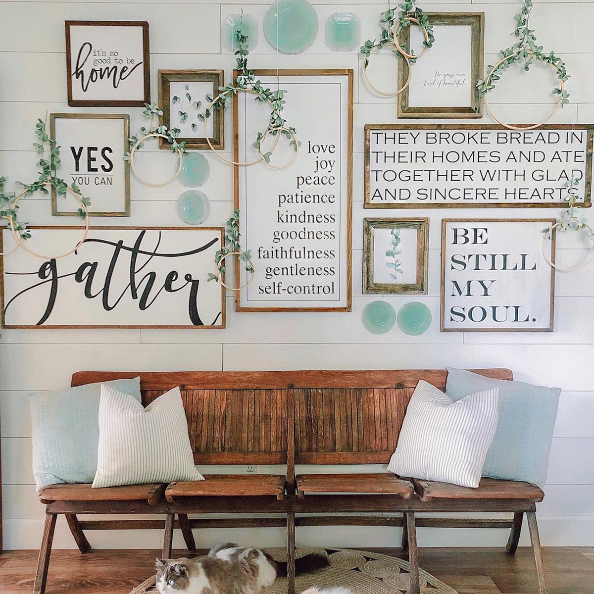
Gallery walls can be for so much more than just artwork. While inspirational quotes are certainly nothing new, we love this oversized twist that highlights one meaningful word in a giant font. Use a selection of different typefaces, layouts and alignments to create interest.
To break up the text, add in wall plates, greenery and knick-knacks by hanging them alongside traditional pieces of art.
The mix-and-match nature of this look also makes it more adaptable, since you can add or take away pieces as you please. It's also one of the best ways to display a growing collection.
7. Ditch the artwork
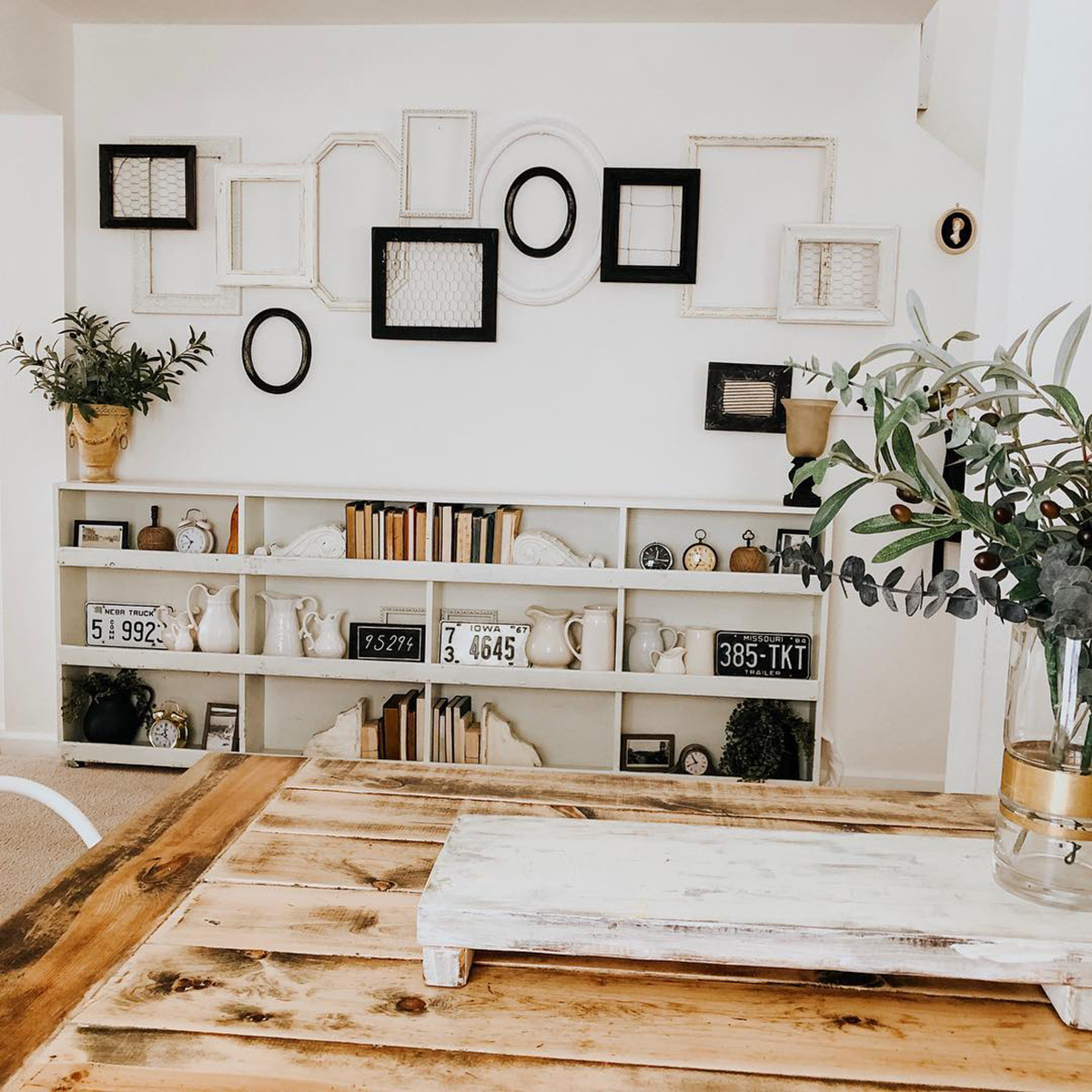
If you aren't an artwork fanatic and are struggling to choose pieces to fit your frames, you could try leaving a row of ornate frames empty to create a striking piece of wall décor.
Pick out a few to fill with chicken wire for some texture, nest smaller frames within bigger versions and overlap the frames to keep it interesting.
So now you’ve seen some beautiful examples, gather up your artwork that’s been collecting dust in a corner and show it off in style.
Comments
Be the first to comment
Do you want to comment on this article? You need to be signed in for this feature