The hidden secrets behind famous American logos
Behind the logos of big American brands
They're on our billboards, in our malls, and often in our homes. But do you really know America's most famous logos as well as you think?
From Starbucks to the CIA, read on to uncover the hidden meanings behind 16 iconic American logos.
Starbucks
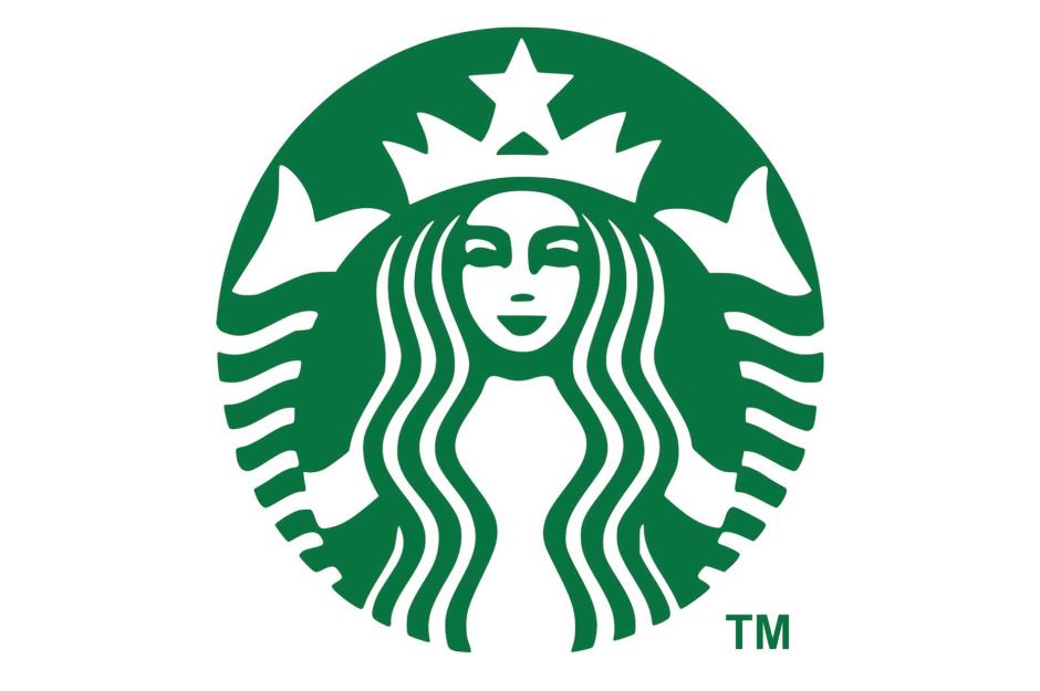
Ever wondered while you were ordering your favorite chai latte why on earth Starbucks chose a mermaid to feature in its logo?
The company founders decided to name their business after a character in Herman Melville's nautical novel Moby-Dick (1851) and, keen to push the seafaring theme, opted for a two-tailed Siren design based on a 16th-century Norse woodcut.
Amazon

Sure, it may be glaringly obvious to some people but it's easy to miss the meaning behind the arrow that underscores the Amazon logo.
The arrow, in the shape of a smile, points from A to Z, implying that the company is a friendly and welcoming one-stop-shop that stocks anything and everything that money can buy.
Sponsored Content
Pepsi
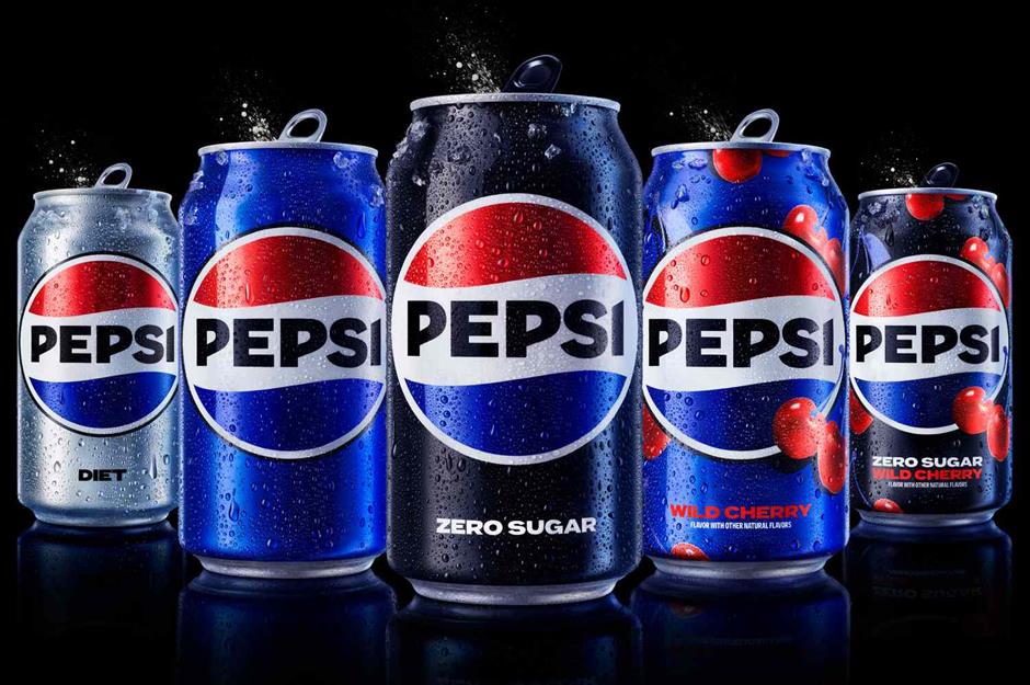
In March 2023, Pepsi unveiled a brand-new logo to tie in with the soft drink brand's upcoming 125th anniversary.
In a press statement about the new-look branding, Mauro Porcini, PepsiCo's Chief Design Officer, said: "Pepsi is a shining example of a brand that has consistently reinvented itself over 125 years to remain a part of pop culture and a part of people's lives... We designed the new brand identity to connect future generations with our brand's heritage, marrying distinction from our history with contemporary elements to signal our bold vision for what's to come."
Pepsi notes that the new design features the color black to show "the brand's commitment to Pepsi Zero Sugar in the future," as well as a "modern, custom typeface [that] reflects the brand's confidence and unapologetic mindset."
The previous version of the "Pepsi Globe" logo reportedly cost at least $1 million (£810k) to revamp in 2009 and was said to make reference everything from feng shui and Renaissance art to the philosopher Descartes and the architect Le Corbusier. But of course...
Apple
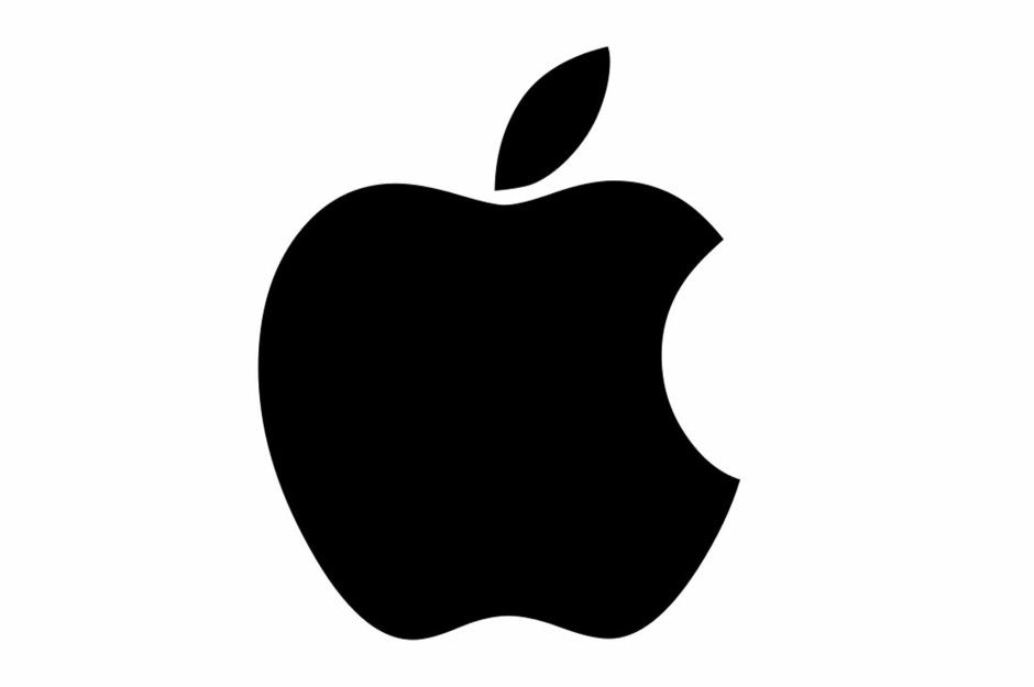
Several urban myths are still doing the rounds about the origin of Apple's logo. Depending on who you listen to, the apple is a tribute to science pioneers Sir Isaac Newton and Alan Turing, or possibly a representation of the fruit that tempts Adam and Eve in the Bible.
However, the logo's designer, Rob Janoff, revealed in a 2018 interview with Forbes that the reality behind the distinctive bitten apple is a little closer to home than you might think.
Janoff came up with the concept to "get people to notice that an Apple computer was not some piece of hard-edged metal that has no place in your home and that your kid wouldn't want to be near."
Cisco Systems
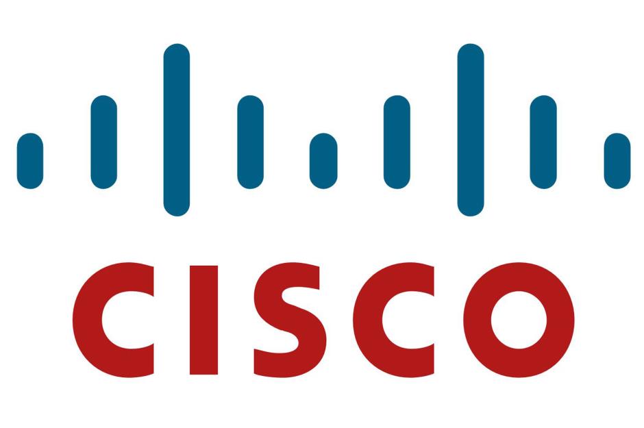
Can't figure out what the vertical lines mean? The clue's in the name: they form an abstract image of San Francisco's Golden Gate Bridge.
On their way to register the company in 1984, the founding team at Cisco crossed the famous suspension bridge. They decided at that very moment to name their company after the city and ended up incorporating the bridge into the logo too.
Sponsored Content
FedEx
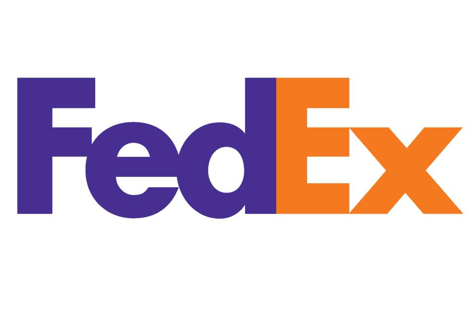
A winner of numerous design awards, FedEx's logo rocks a subtle yet incredibly smart graphic design trick.
The space between the "E" and the "x" forms a forward-pointing arrow, which reflects the company's dynamic, forward-thinking ethos.
The CIA
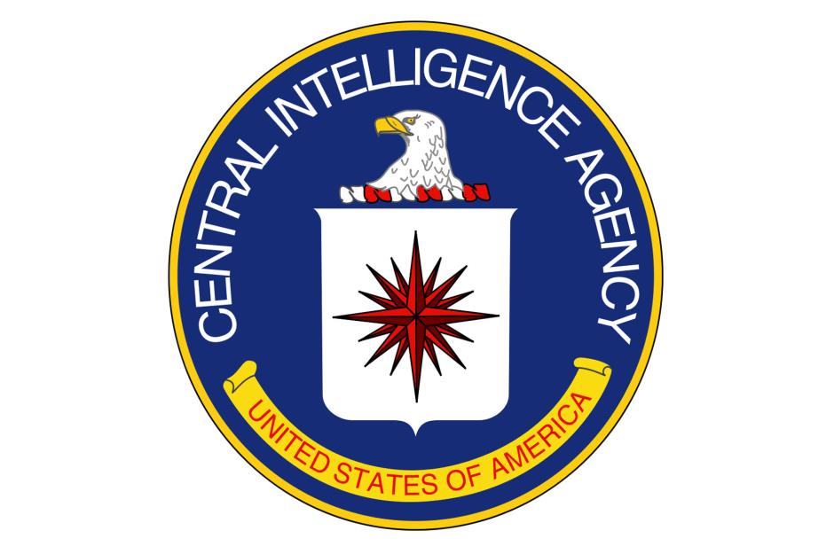
The CIA's imposing logo features three potent symbols, starting with the all-powerful eagle. The national bird of the USA, the eagle sits at the very top of the design and represents "strength and alertness" according to the organization's website.
There's also the shield, which symbolizes protection, and the compass rose, which has 16 spikes pointing in all directions and signifies the agency's global intelligence-gathering capabilities.
Wikipedia
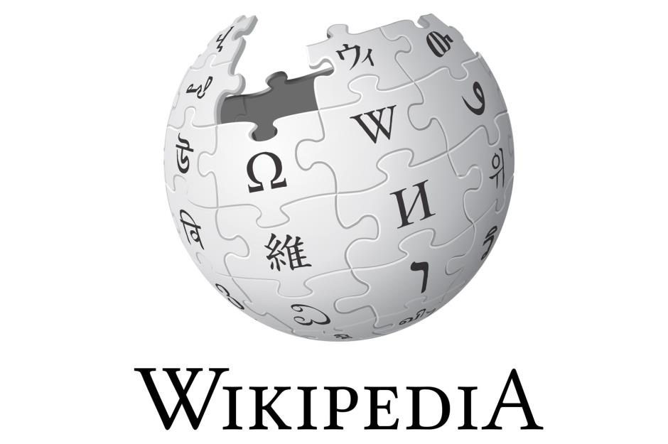
The world's number-one online encyclopedia has a suitably intelligent logo.
The jigsaw pieces that make up the unfinished globe each feature characters from different alphabet systems, such as the Greek "omega" and the Latin "W." The globe itself represents Wikipedia's multilingual character and its huge round-the-world reach.
Sponsored Content
Picasa
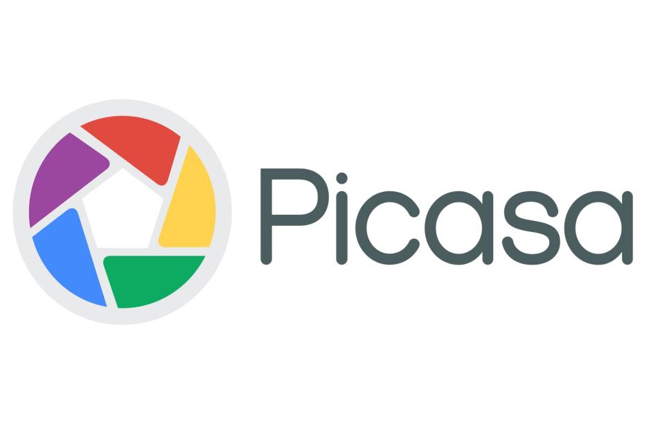
You might need to speak a bit of Spanish to work this one out. The primary colors of Picasa's logo are laid out in the style of a camera shutter – okay, that part's pretty obvious.
But if you look more closely, you'll notice the outline of a house. House translates into "casa" in Spanish, meaning the logo is a super subtle nod to Google's now-retired image organizer platform.
Baskin-Robbins
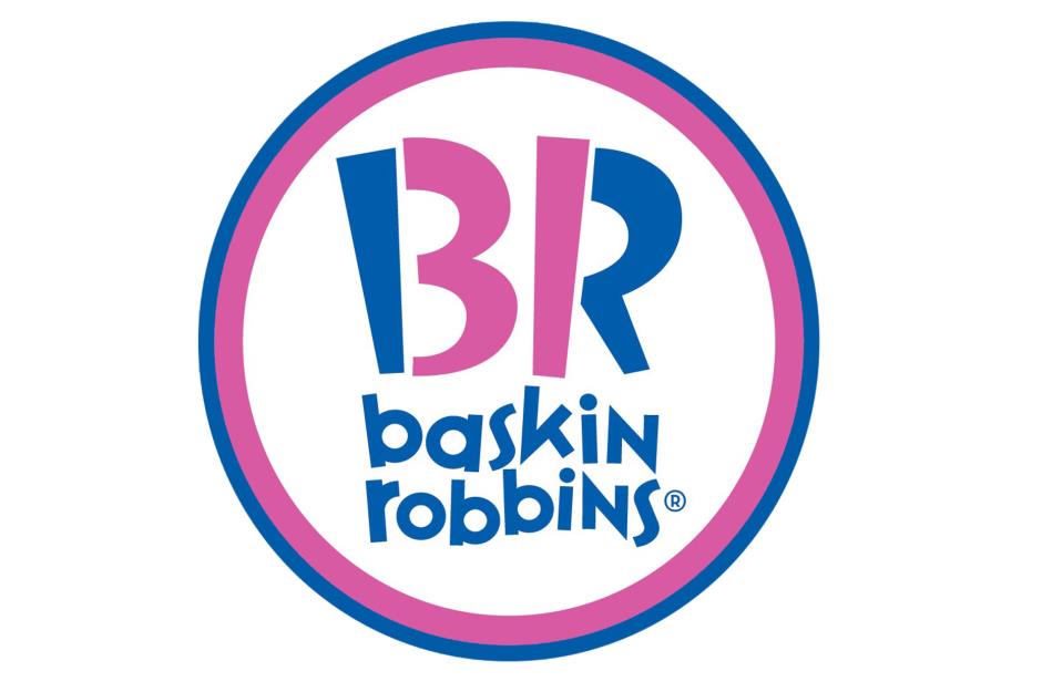
American ice cream franchise Baskin-Robbins is famed for its "31 flavors" slogan, so it's no wonder that the number 31 is hidden in the company logo – but where?
Look a little closer and you'll spot the figures concealed within the letters "B" and "R." Though the logo was redesigned in 2007 to cleverly conceal the digits, the number 31 has always featured within the logo of the company, which was founded in California in 1945.
Dell
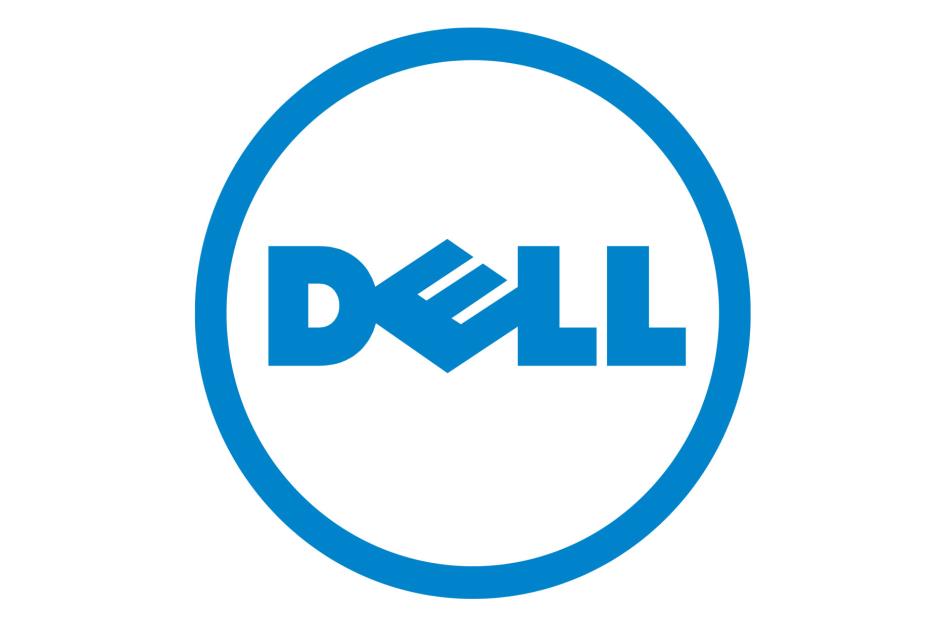
The Dell logo is a relatively simple affair, apart from that slanted "E."
Company founder Michael Dell started his business with the aim to "turn the world on its ear," and when creatives from design firm Siegel+Gale devised the company logo in 1984, they decided to represent this by tilting the letter "E."
Sponsored Content
Pittsburgh Zoo
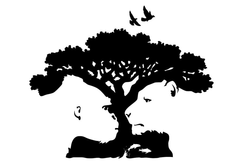
The logo for the Pittsburgh Zoo & PPG Aquarium makes clever use of its white space.
If you look closely at the design, you'll notice a gorilla, a lion, and a small shoal of fish in the surrounding outlines of the tree.
Beats by Dre
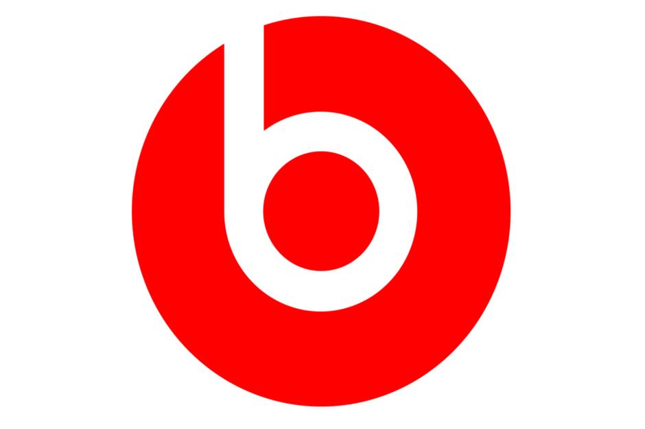
Another masterclass in clever branding, the Beats by Dre logo includes a lower-case "b" that also forms an abstract image of a person listening to the must-have headphones. As simple as you can get, sure, but undeniably effective.
Levi's

The Levi's logo might be instantly recognizable but have you ever wondered why it's that particular shape?
The curved lines at the bottom of the logo mirror the distinctive stitching that features on the back pockets of Levi's jeans.
Sponsored Content
Paramount
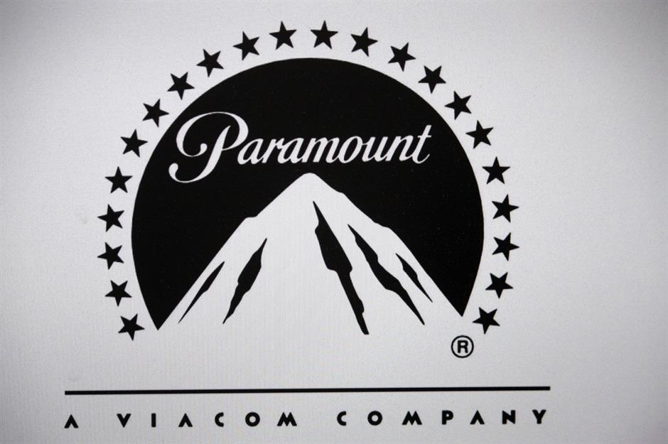
One of Hollywood's longest operating film studios, Paramount has produced some of the world's most famous films and TV shows.
The mountain in its logo was reportedly designed by one of the company's founders, William Hodkinson, while the 22 stars that surround it represent the number of actors the studio had signed at the time.
However, the logo for the company's new streaming service, Paramount Plus, features just 13 stars. Why? Because each star represents a letter in the platform's name.
The size of the stars has also been fractionally increased "to come across more clearly on phone apps, push notifications, and other digital applications," according to Paramount's website.
Domino's Pizza
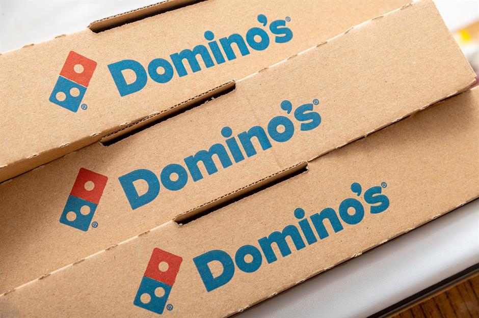
Ever found yourself wondering why there are three dots on this logo? The designers behind the branding reportedly opted for this to reflect the fact that the pizza chain had three locations, with the idea that more dots could be added as and when new outlets opened.
The company clearly abandoned that idea, and we can see why. With 19,880 stores around the world as of 2022, that would have been a whole lot of dots...
Now discover the big-brand logo redesigns that really worked – and the ones that really didn't
Comments
Be the first to comment
Do you want to comment on this article? You need to be signed in for this feature